About Us
WebDesignVR works with both small and large companies to provide them with one-of-a-kind professional solutions for their businesses.
View More
WebDesignVR works with both small and large companies to provide them with one-of-a-kind professional solutions for their businesses.
View More

26 May 2026 website Design Admin
A website can look amazing on a desktop screen and still feel frustrating on a phone. Honestly, that’s where many businesses quietly lose potential customers.
Slow pages, tiny buttons, broken layouts, or menus that feel awkward on mobile usually push visitors away fast. Most people won’t even try to figure things out. They simply leave and check another website instead.
That’s one reason businesses investing in Website Design Services in Houston are paying more attention to usability across all devices instead of focusing only on visuals. Modern websites need to work smoothly every where phones, tablets, laptops, and larger screens too.
And with mobile traffic continuing to grow, design decisions now affect SEO more directly than before.
A few years back, businesses could get away with a desktop-focused website. Things changed pretty quickly, though. Most visitors now browse from their phones first, especially when searching for services or comparing local businesses.
That’s why companies using Website Design Services in Houston are focusing more on speed, mobile usability, and smoother customer experiences instead of only flashy homepage designs.
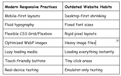
Modern websites usually perform better when designers start with smaller screens first instead of shrinking desktop layouts later.
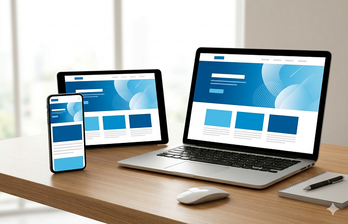
Starting with mobile forces businesses to focus on essential content earlier. It naturally removes unnecessary clutter and creates cleaner page structures.
A lot of businesses using Mobile-First Web Design Houston strategies notice better navigation and faster websites simply because mobile layouts demand simplicity.
Highlights:
Google’s mobile-first indexing also makes this approach important for long-term search visibility.
Older websites were often designed around popular device sizes. The problem is, devices keep changing constantly.
Modern developers now create breakpoints when the layout actually starts looking awkward instead of targeting specific screen models.
Highlights
This usually creates a more natural browsing experience across tablets, foldables, and ultrawide screens.
People browsing on mobile typically want quick answers. Contact details, service information, pricing, and navigation should appear without endless scrolling. Big sliders and oversized banners often hurt usability more than they help.
Highlights:
Many businesses offering Website Design Services in Houston now prioritize cleaner mobile layouts because overloaded pages tend to reduce conversions.
Fixed-width layouts don’t work very well anymore. Modern websites need flexibility built into the design itself.
CSS Grid and Flexbox changed frontend development quite a bit. Grid works well for larger layouts, while Flexbox handles alignment and spacing more efficiently.
Instead of forcing rigid pixel-based layouts, these tools help content adjust naturally across screens.
Highlights:
Many developers handling custom web design Houston projects combine both Grid and Flexbox for smoother responsive layouts.
Typography gets overlooked surprisingly often. Text that looks balanced on desktop screens can suddenly feel cramped on mobile devices.
Modern CSS functions like clamp() allow text sizes to scale more naturally between screen sizes.
Highlights:
Fluid typography has become increasingly common in modern responsive design systems because it improves consistency without constant manual adjustments.
Using units like rem, em, vw, and vh creates layouts that adapt more naturally than fixed pixels. Even spacing tends to feel smoother this way.
Highlights:
Relative sizing also helps websites perform more consistently across different resolutions and zoom levels.
Even a beautiful website feels frustrating if it loads slowly. People expect websites to open quickly now, especially on mobile connections.
Image Optimization
Large image files are still one of the biggest reasons websites become slow. Modern formats like WebP and SVG help reduce file sizes without noticeably affecting image quality.
Highlights:
Optimized images also support better Core Web Vitals performance.
Not every image or video needs to load instantly when the page opens. Lazy loading delays media until users actually scroll near it, which improves initial speed.
Highlights:
This has become a common practice in modern responsive design workflows because users expect near-instant loading now.
Too many plugins, scripts, and external assets can slow websites down badly over time. Combining CSS and JavaScript files where possible usually improves loading performance.
Highlights:
An experienced web design Company in Houston will often audit bloated plugins and unnecessary scripts during redesign projects.
Responsive websites aren’t only technical projects. They directly affect how comfortable visitors feel while browsing.
Buttons and interactive elements should feel easy to tap without frustration. Small touch targets are still surprisingly common on older websites.
Highlights:
Most UX recommendations suggest touch targets around 44px–48px minimum for mobile users.
Navigation should adjust naturally between desktop and mobile layouts. Hamburger menus and sticky navigation bars help reduce clutter while keeping important pages accessible.
Highlights:
Many Mobile-First Web Design Houston projects now focus heavily on simplifying menus because complicated navigation often increases bounce rates.
Users no longer browse websites with only a mouse. Touchscreens, keyboards, trackpads, and styluses all play a role now, especially on hybrid devices.
Highlights:
Modern websites need flexibility because browsing habits continue to change pretty quickly.
Web trends move fast. A website built only for current devices can start feeling outdated sooner than expected.
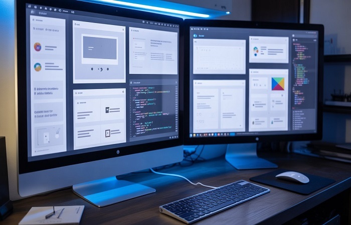
Frameworks like Tailwind CSS and Bootstrap 5 help developers build responsive layouts more efficiently. Still, tools alone don’t automatically create great websites. Structure and usability matter more.
Highlights:
Teams managing custom web design Houston projects often prefer utility-first frameworks because they simplify maintenance.
Testing only through browser emulators usually misses real-world issues. A layout may work perfectly on desktop but behave differently on an actual mobile device with slower internet.
Highlights:
Even experienced developers regularly find issues only after testing on physical devices.
Modern websites need more than attractive visuals. They need speed, usability, flexibility, and strong mobile performance too.
Businesses investing in Website Design Services in Houston are focusing more on user experience because it directly affects SEO, customer trust, and conversions. A smart web design Company in Houston strategy helps websites stay functional across devices without feeling outdated or overloaded.
From mobile-first layouts to flexible CSS systems and performance optimization, even small improvements can noticeably improve how visitors interact with a website.
And honestly, users notice those improvements pretty quickly.
Why is mobile-first design important?
Mobile-first design improves usability on smaller screens and aligns with Google’s mobile-first indexing system.
How does responsive design improve SEO?
Better mobile usability, faster loading times, and smoother browsing experiences can improve engagement signals and search visibility.
What are the best CSS tools for responsive layouts?
Flexbox and CSS Grid are commonly used because they help create flexible layouts across different screen sizes.
Why should websites use WebP images?
WebP images reduce file sizes while maintaining good visual quality, helping pages load faster.
How often should responsive websites be tested?
Websites should ideally be tested regularly after updates and across real devices to catch usability issues early.

Lorem Ipsum has been the industry's standard dummy text ever since the 1500s, when an unknown printer took a galley of type and scrambled it to make a type specimen book.