About Us
WebDesignVR works with both small and large companies to provide them with one-of-a-kind professional solutions for their businesses.
View More
WebDesignVR works with both small and large companies to provide them with one-of-a-kind professional solutions for their businesses.
View More

20 Aug 2025 Web development guide Emma Adamson
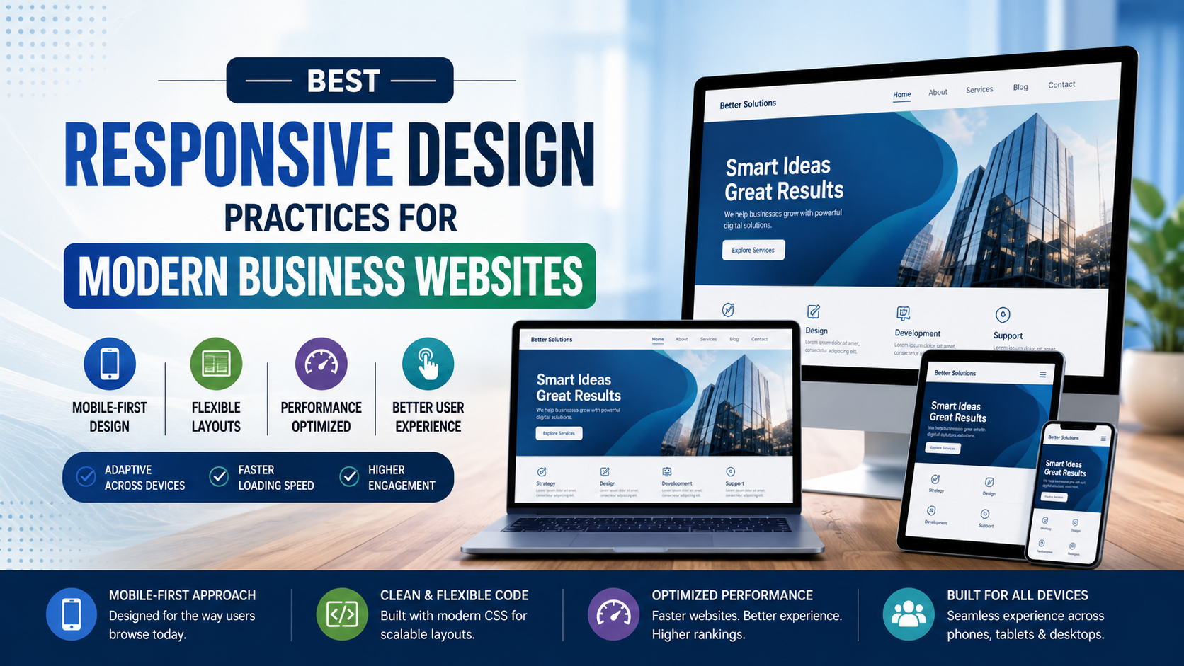
Do you know that mobile devices are responsible for 63% of all web traffic globally, and a vast majority of that traffic is coming from the USA? As people shift browsing, shopping, and interacting on smartphones, it's clearer than ever that mobile-friendly web development is now an essential part of a web developer's life, rather than an option.
In this post, we will discuss why elements such as responsive design frameworks, mobile-first indexing, and fast-loading mobile pages have become standards for U.S. digital space, and how quality providers like WebdesignVR are paving the way.
Mobile-friendly sites are more likely to utilize HTTPS and site safe design principles, which translates into greater confidence in visitors regardless of the device.
For businesses in the USA market, the cost of being non-mobile-friendly is significant.
Their problems will not only be a detriment to user satisfaction, but also the conversions and overall brand perception.
You can test your website's mobile-friendliness in just a few minutes, as there’s no need to guess.
Go to Google Mobile-Friendly Test and enter your URL.
There are also tools like Responsinator that can show you what your site looks like on multiple devices.
You can create a test environment using Chrome's built-in Tool and its ability to designate screen size using the device toolbar.
However, the best test is still to manually test your site using an actual smartphone or tablet.
So, how does mobile-friendly web development help with your digital performance? Here are a few ways that custom mobile-only development offers different results:
WebdesignVR is another great example that builds websites that not only look and function great on a computer but perform extremely well on mobile. It is a result of blending user and Google needs that are constantly evolving.
The best partners for mobile-friendly web development are more than just about design. They are strong in several areas:
Agencies that understand frameworks like Bootstrap, Tailwind, or Foundation can build sites that flap around well on all devices. They can translate brand personality into responsive layouts without sacrificing usability.
2. Mobile-First Indexing
Top developers develop with the model of Google's indexing model in mind. They make sure that the mobile version and desktop version have comparable, fully accessible content to protect against the loss of search visibility.
The best builders consider performance first. They take time to compress images and minify HTML/CSS. They think about all of these actions because they want to ensure that their sites load well with great performance. For mobile audiences, great performance benefits load times and affects Core Web Vitals.
Leading design firms in the USA build the mobile elements of the site with UX in mind. You are hoping for highlights such as mobile navigation, buttons that are touch-friendly, and providing access to the site's core content right away. These advantages aren't often front of mind to designers/developers, but they lift engagement and reduce frustrations.
The best do not just build. They measure and change. Great development firms will set up mobile engagement analytics, heatmaps, and conversion events, and hook them back into the design, planning the next phase of the project iteratively.
WebdesignVR brings all of these to the table to build mobile experiences that are fast, responsive, and grounded by behaviour data that focuses on the mobile user.
Mobile-friendly web development isn’t simply an add-on for companies in the USA, but it’s essential. With more visitors browsing your content via mobile, a Google search algorithm that is beginning to favor mobile content, and user expectations higher than they’ve ever been before, your site needs to be fast, responsive, and easy to navigate.
Every technical and creative decision you make, from responsive design frameworks to fast-loading mobile pages, will impact your ability to retain attention, generate conversions, and create real value. If you're ready for Google and users to love your site, at WebdesignVR, they’ll build a mobile-first solution that performs, is relevant, and drives meaningful outcomes.

Lorem Ipsum has been the industry's standard dummy text ever since the 1500s, when an unknown printer took a galley of type and scrambled it to make a type specimen book.